Echarts教程之通过Ajax实现动态加载折线图的方法
时间:2018/5/9 21:55:35阅读:
一、GIF图二、前台代码// 调用方法 hotlineLine(); // 定时刷新 setInterval(function () { hotlineLine(); },5000); function hotlineLine(){ // 初始化图表元素 var hotlineLine = echarts.init(document.getElementById(hotlineLine_id)); $.get(${pageContext.req…
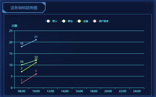
一、GIF图
二、前台代码
// 调用方法
hotlineLine();
// 定时刷新
setInterval(function () {
  hotlineLine();
},5000);
function hotlineLine(){
  // 初始化图表元素
  var hotlineLine = echarts.init(document.getElementById("hotlineLine_id"));
  $.get("${pageContext.request.getContextPath()}/m/hotline.do", function (res) {
    var option = {
      // 提示框组件,鼠标经过饼图时会出现提示框
      tooltip: {
        // 触发类型
        // 坐标轴触发,主要在柱状图,折线图等会使用类目轴的图表中使用。
        trigger: "axis"
      },
      // 每条折线的颜色
      color: ["#87CEFA", "#9AFF9A", "#C0FF3E","#DB7093"],
      // 图例组件
      legend: {
        // 内容
        data:["呼入", "呼出", "应答", "用户放弃"],
        // 样式
        textStyle:{
            fontSize:10,
            color:"#66ffff"
          },
        // 上距离,类似css中的margin
        top:"5%"
      },
      // 网格
      grid: {
        // 左距离
        left: "7%",
        right: "5%",
        bottom: "10%",
        top:"20%"
      },
      // 横坐标
      xAxis: {
        // 类型
        type: "category",
        // 刻度
        data: ["08:00", "10:00", "12:00", "14:00", "16:00", "18:00", "20:00", "22:00", "24:00"],
        // 样式
        axisLine:{
          // 横坐标线的颜色
          lineStyle:{
            color:"#66ffff"
          }
        }
      },
      yAxis: {
        type: "value",
        name: "次数",
        axisLabel: {
          formatter: "{value}"
        },
        axisLine:{
          lineStyle:{
            color:"#66ffff"
          }
        },
        splitLine:{
          show: true,
          lineStyle:{
            color:"#66ffff"
          }
        }
      },
      series: [
           {
             name:"呼入",
             type:"line",
             data:res[3]
           },
           {
             name:"呼出",
             type:"line",
             data:res[2]
           },
           {
             name:"应答",
             type:"line",
             data:res[1]
           },
           {
             name:"用户放弃",
             type:"line",
             data:res[0]
           }
        ],
        // 文本标签
        label: {
          //是否展示
          show: true,
          position: "top",
          textStyle: {
            fontWeight:"bolder",
            fontSize : "12",
            fontFamily : "微软雅黑",
            color:defaultColor
          }
        }
    };
    hotlineLine.setOption(option);
  });
}
<div class="rightMain01-sub03 box-border">
  <div class="box-title">话务指标趋势图</div>
  <div class="rightMain01-sub03-data">
    <div id="hotlineLine_id" style="height:340px;"></div>
  </div>
</div>